

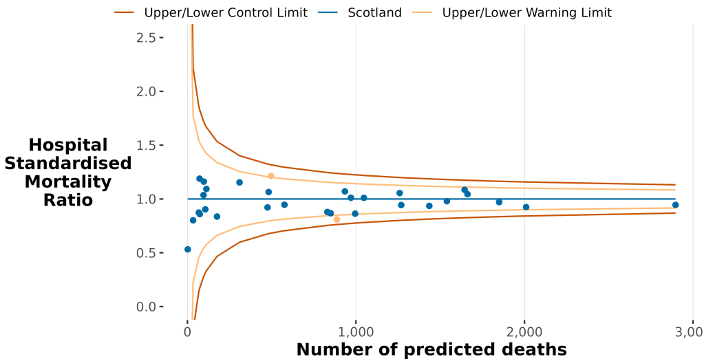
From Hospital Standardised Mortality Ratios January 2025 to December 2025 published today, the above chart and:
No hospitals had a significantly higher standardised mortality ratio than the national average.
HSMR acts as a signal, highlighting hospitals where mortality is higher or lower than predicted. This prompts hospitals to review their care processes, check for possible issues and identify areas for improvement.
In Scotland, the national HSMR is set at 1.00. A hospital with an HSMR less than one has fewer deaths observed than predicted within 30 days of admission, whereas an HSMR greater than one indicates more observed deaths than predicted in the same period.
The above funnel chart allows the presentation of hospitals with widely varying sizes on one illustrative image. The blue dot at the extreme right is the so-called Queen Elisabeth University Hospital in Glasgow and those to the left are the tiny ‘county’ hospitals such as those in the Borders and the Western Isles. The QEUH had an HMSR of 0.94 and 200 fewer deaths than predicted. The QEUH has had this level for years now and is thus, objectively, not ‘troubled’ , as much as Anas Sarwar and Scottish Labour might wish it was.
Things are very different in England, with a clear postcode lottery:
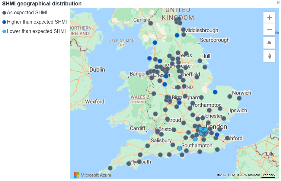
Look above at the clustering of high high mortality (mid blue) in the north and of low mortality (pale blue) in the more affluent south.
Look below at the 10 English hospitals with significantly higher, above 1.2, mortality rates:
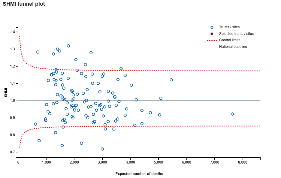
Blackpool, 1.31, had 600 more deaths than predicted. Medway 1.29, had 400 more deaths than predicted. All ten are in the North other than one in Norfolk and one in Coventry.
While, in Scotland, you need not worry where you are treated, there are hospitals in England you might want to avoid.
Source: https://digital.nhs.uk/data-and-information/publications/statistical/shmi/2026-04
Discover more from Talking-up Scotland
Subscribe to get the latest posts sent to your email.

One thought on “No hospital postcode lottery in Scotland as Glasgow’s giant is revealed as one of safest in Scotland and far safer than several of NHS England’s really troubled hospitals”