

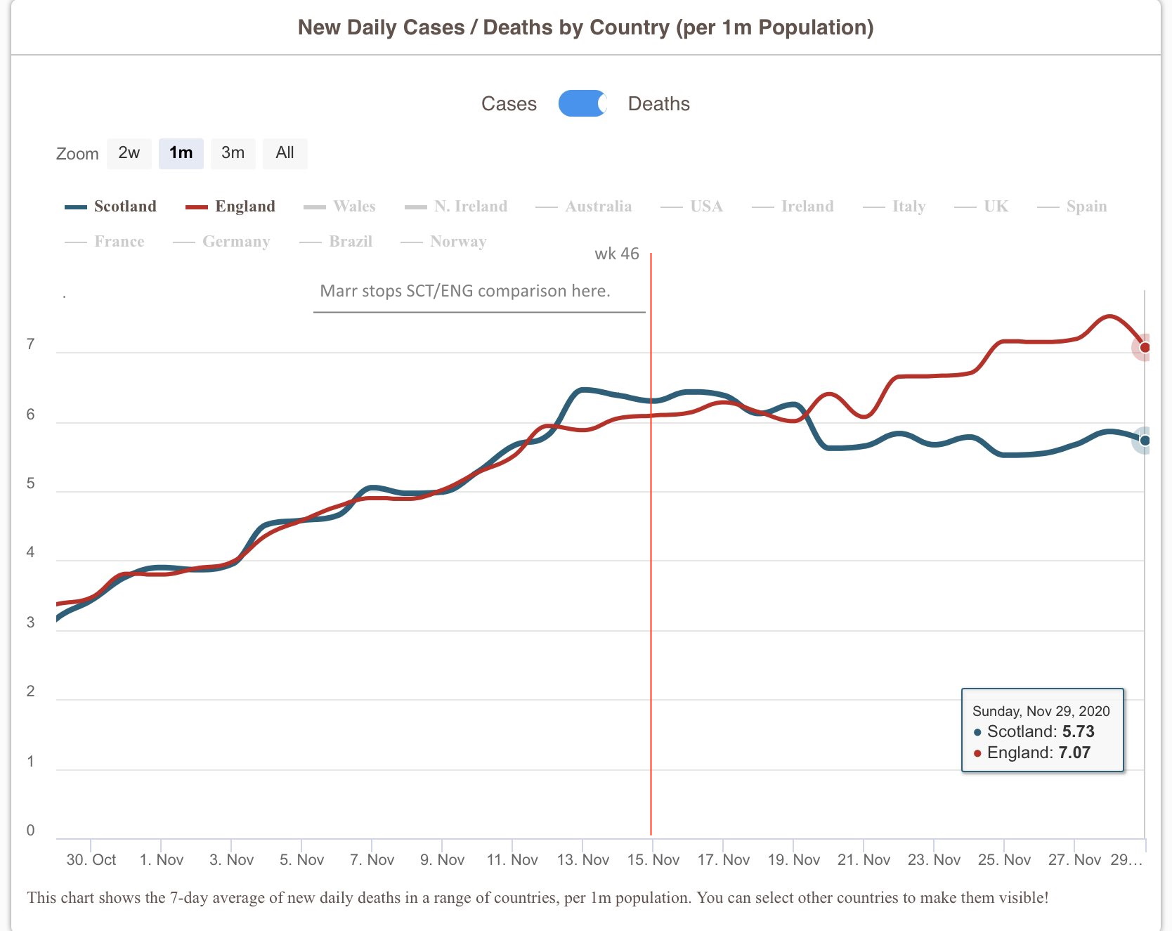
The graph above shows how the Covid death rate in Scotland and England was similar until the 20th November when they began to diverge.
The rate had been far lower for long periods before that explaining the overall gap between 681 per 1 million in Scotland and 906 in England.

Marr’s use of a carefully selected subset of only 4 weeks between 19th of October to 9th of November, finishing 3 weeks before the broadcast (!) was scandalous.

Dear reader, put a complaint in.
https://www.bbc.co.uk/contact/complaints/make-a-complaint/#/Complaint
Discover more from The 'Unstoppable' Talking-up Scotland
Subscribe to get the latest posts sent to your email.

Just complained to BBC.
LikeLiked by 2 people
Done.
John, a big thank you for all your work.
LikeLiked by 1 person
Sent complaint
LikeLike
Complain issued, Marr is pathetic and serially biased.
LikeLiked by 1 person
Lies,damn lies and statistics.You can prove whatever you like with careful manipulation of numbers.
LikeLike
I’ve demanded the charlatan be sacked.
LikeLiked by 1 person
Are you turning tory .Belgium population is about twice that of Scotland and about a fifth of engurland
Get Outlook for Android
________________________________
LikeLike
I think the use of Belgium as a comparator was in terms of area. Because of its fairly high population, Belgium has a high density of population and I suspect that population density is a significant factor in infection rates. Because of the EU institutions it has a lot of international travel.
Apart from Chile, there is no other country similar to Norway – very long, very narrow and largely on steep slopes of a mountain range. So, apart from the south which contains Oslo and Bergen, Norway is very sparsely populated and the isolation of many communities means transmission is difficult.
In Scotland, the population is largely in the Central belt, with Glasgow and surrounding towns being densely populated, infection rates are high. In the Northern and Western Islands and in the more sparsely populated areas, infection rates are low. In the ‘first wave’Shetland had relatively high per capita rates, which was probably attributable to travellers associated with the oil industry.
LikeLiked by 1 person
Will rephrase
LikeLike
Yes by all means put a complaint in as I have
In my Uni.research days the Statistician in charge of approving your data and results
From a experiment
Would in the strongest possible terms dismiss such a graph that blatantly skews the reality of what actually happened
But fret not soon and in the coming weeks
And especially the next 4 weeks the opposite
More than likely happen
I constantly monitor the deaths,infections,ICU & Hospital admissions
And as the path this virus takes is rather predictable.
Scotland had its schools and Uni.return earlier and that explains what is shown in Marr,s graph
Just wait 4 more weeks and quite the opposite will happen
Throw it back in his face
It takes 2 to tango and it is time to tell him
Andrew you have been Tangoed when it arises
I assure that pro rata ICU And Hospital nos.
In England for the last 10 days are seriously
Disproportionate to that of Scotland
That can but only lead to a disproportionate
Increase in England’s death rate
Andrew my dear fellow
Be Very Very Careful of What You Wish for
LikeLike
Best if you relate the complaint to the specific show as the BBC will ask for the date and time of the broadcast. Not having seen the item in question it makes the complaint less specific and treated on a lower scale by the BBC as a result.
LikeLike
Yes, have done
LikeLike